ESL's Overlays
The hardest choices...
A look through time nitpicking showcasing every problem that can be found in the overlays used by ESL for their premier events in Rainbow Six Siege.
Year 1
Season 1
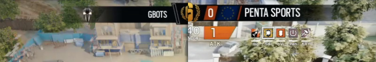
During its introduction at Gamescom, not much could be said about the overlay. The biggest flaw at the start of a new era in competitive Rainbow Six were the lack of transparent images for some of the participants, as well as missing map scores. Both problems would be alleviated later when Pro League left the big stage.
You can click on images.
Nonetheless, flaws can be found. One of which is a flaw that will plague Pro League for seasons to come; misaligned text.

But what about the X axis? Well our friends at ESL did not forget about that one either.
Seasons 2 & 3
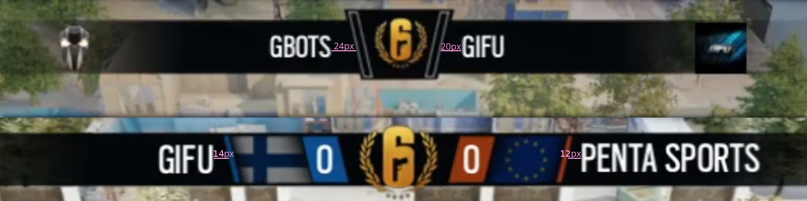
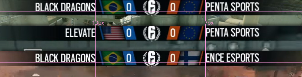
This overlay would see use throughout year 1, with minor changes made to the alignment of text. Fixing the horizontal alignment between the teams.
In hindsight; they probably centered the info text rather than making it left aligned.
Now, I know what you're thinking, "but they fixed it in season 3!", and they did, at the offline finals, just not during the online stage.

The first invitational
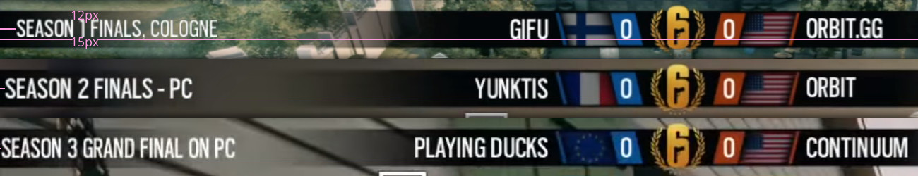
By now you're probably wondering if the first Invitational also had problems. And yes, there's no drop shadow underneath the blue block. Between matches they also shifted the ESL logo in the bottom right corner, but that's irrelevant to this.
No way for NA to lose this one.
Year 2
Seasons 4, 5 & 6
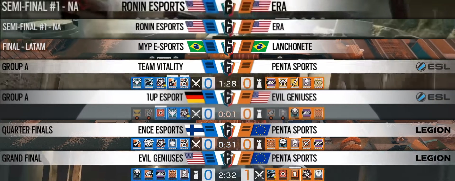
Year 2 started with a bang, and with a bang I mean a new format, new branding and the return of ESL's nemesis: vertical alignment. Not mentioned are the map scores, they're obvious enough so they don't need explaining.
I have a PHD in detecting alignment issues.
However, Season 6 also saw the return of a German dominated team. And whereas every other flag has faded edges and lines up vertically, the German flag does not, and in doing so, proved to be quite challenging to deal with for the German based ESL.

The second invitational
The 2018 Six Invitational overlay had gone through several revisions, from the first time it was shown during the qualifiers all the way to the playoffs. Most of its changes are purely cosmetic, really obvious flaws such as during the North American qualifiers were quickly fixed during the match and the biggest persistent "flaw" being the usage of non-centred map indicators.
I want to delete my memory to reexperience it.
Year 3
Season 7
With slight modifications made, ESL was ready to continue using the Invitational overlay for Season 7. Changing the white colour scheme for a darker dark grey as well as centring the map indicators. Come offline finals however they decided to get rid of the flags and re-introduce the team logos we last saw way back in the Pro League introduction days at Gamescom, for what can only be described as an incredibly clean look.
The difference is 14 pixels.
Season 8 and the major
The alignment of the dividers being slightly off is the most prominent for season 8, but I like this design, it's pretty much a flat version of the year 1 overlay so it gets nostalgia points.
For Paris we got something completetly different compared to anything we've had so far, two colours in the score indicator! Beyond that the flags are only there for a few seconds just to remind viewers that EG is in fact still an american team and didn't acquire the now G2 lineup.
The shield is really just a big plate.
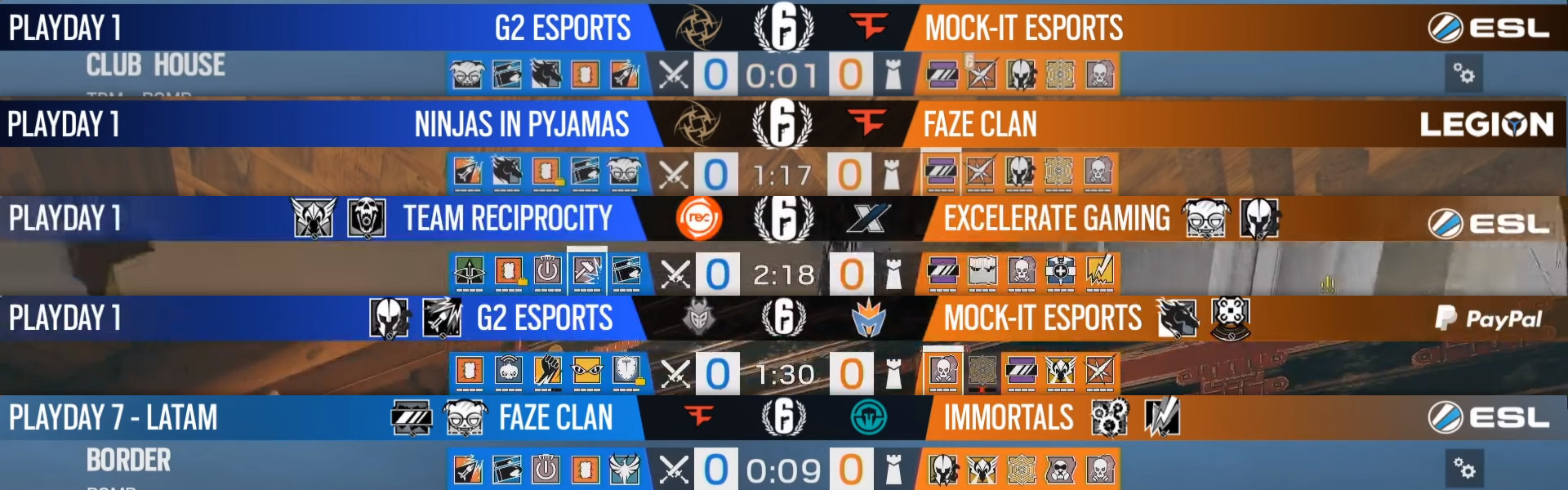
Season 9
Oh boy, people actually noticed something wrong with this one. With a new design some problems can be expected, and most of them got fixed by the time EU started. Beyond the one that got noticed, that being the shape and angle, the image sizes are all over the place. After week 1 it was fine though, might still be worth it to investigate FaZe Clan's logo however.
The early bird catches an overlay without operator bans, and a rebrand or two.
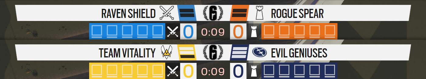
Maybe one day we might get configurable colours for teams rather than just blue and orange. Probably around the same time the game gets colourblind options and when ESL will force unoriginal orgless teams to use names from old Rainbow Six titles. Just like how in alpha blue and orange were called Raven Shield and Rogue Spear respectively.
Not the best colours, and there is a new look but this one is easier to work with.
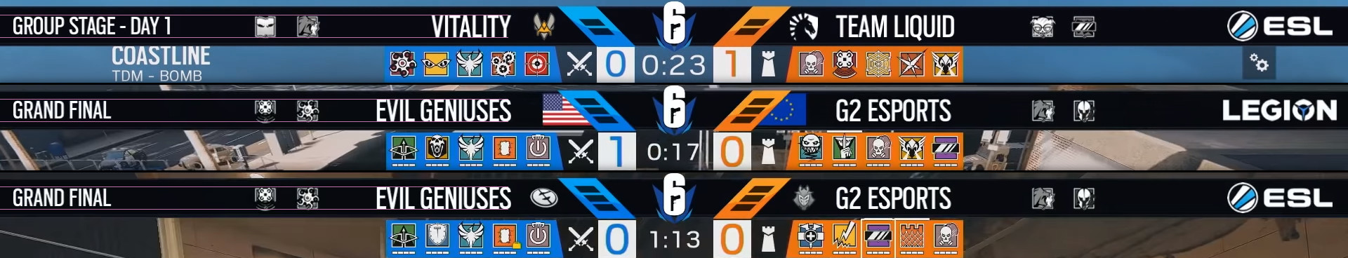
The 'G2-vitational'
There was so much cool shit shown here on stage, they even managed to remain consistent the whole way through, from qualifiers to grand finals. I would say third time's a charm, but then there's the vertical positioning on those team logos, so, go fourth?
The future
Hope you liked this look back, I mean no bad intentions with this post and it's mainly a joke. In hindsight, I probably should've titled this "Why Pro League Was Doomed To Fail" just to get those extra clicks.
This is probably a good time to plug MapBan.eu, if you're a commentator or a streamer, then you should consider applying for their Premium service, their solution should prevent most of these problems from occurring. You can also use the program I made eons ago back when everyone used photoshop and text sources.